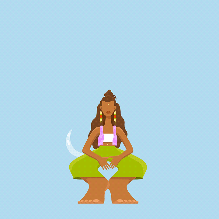

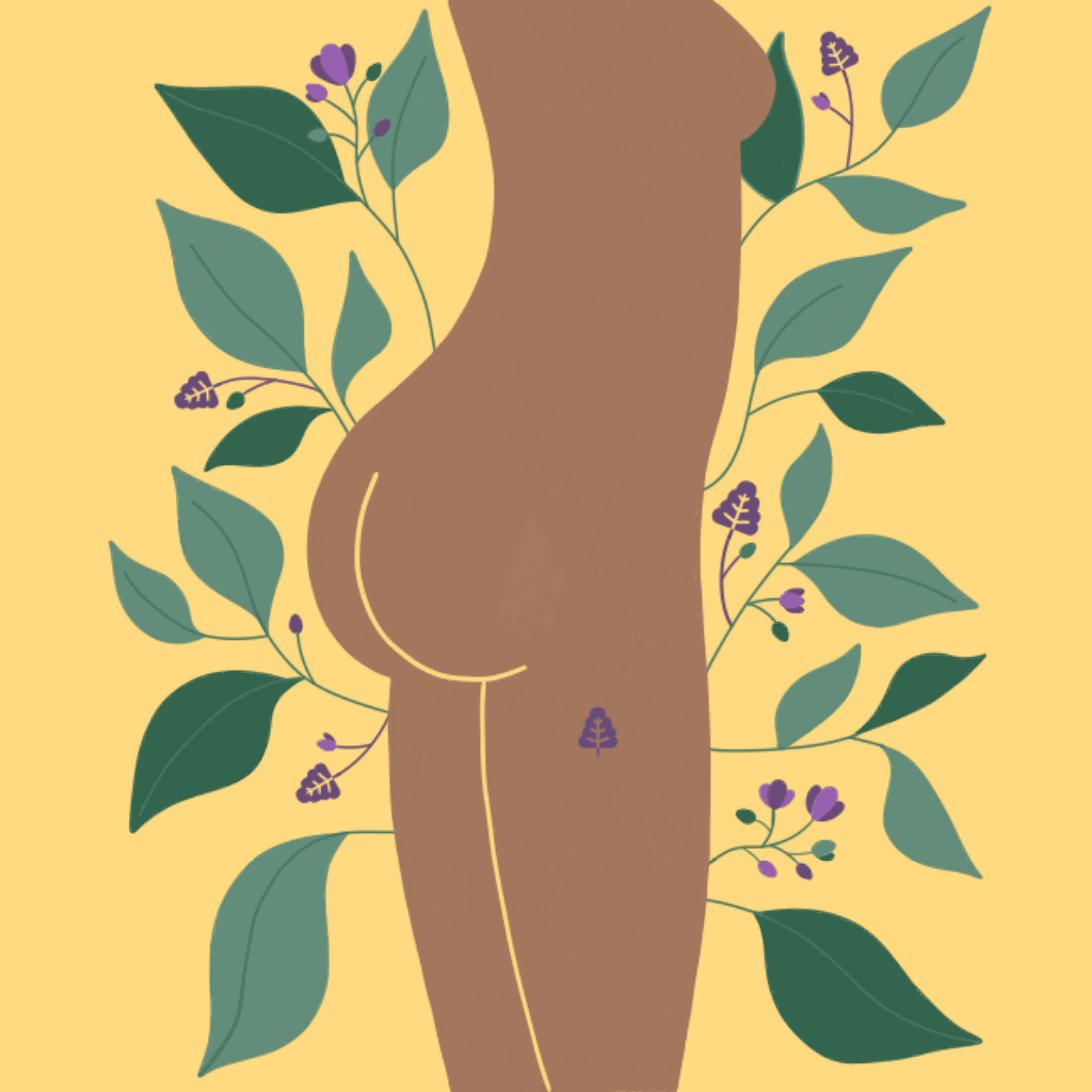
Papermoon is a Melbourne based personal care brand whose core values include luxury, inclusivity and sustainability, with an unexpected twist of androgynous visuals leading their packaging designs. With their already established brand identity, we took the existing illustrations from their body oils and butters range and created moving graphics for their online ad campaigns across Facebook and Instagram.


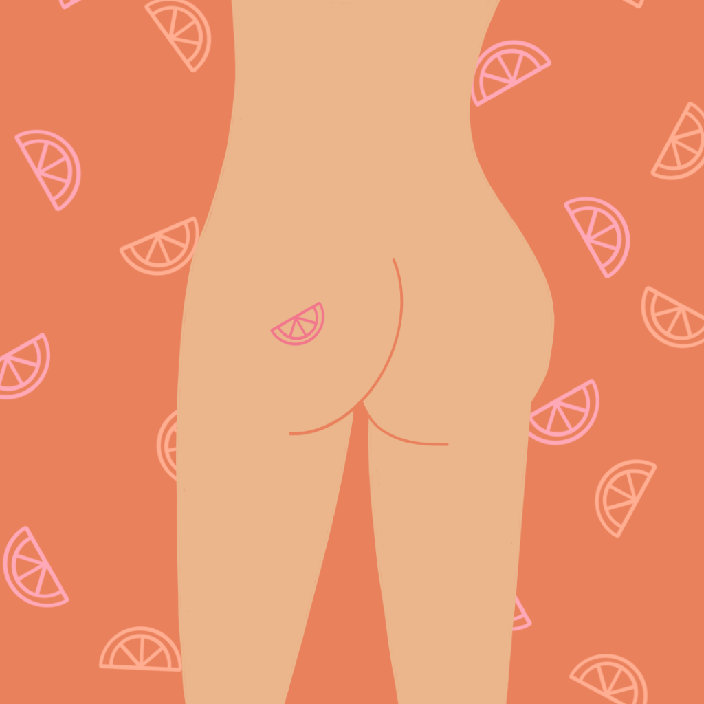

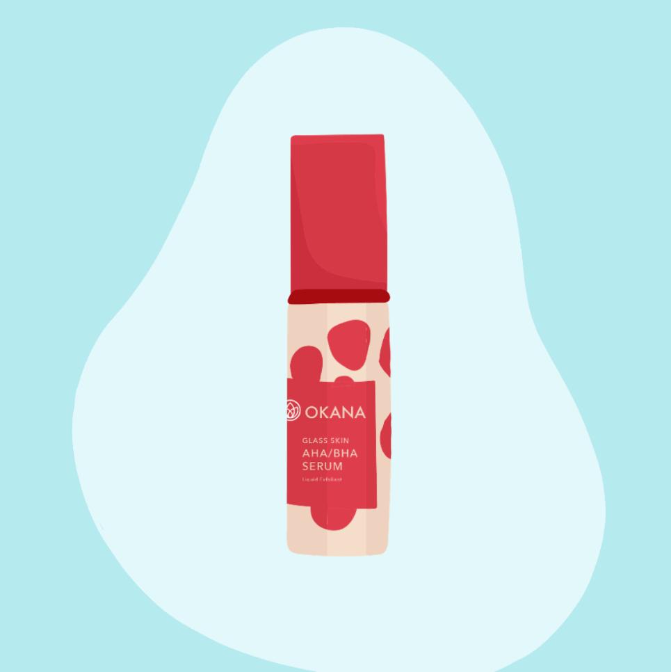
Okana is a humble and friendly natural skincare brand from New Zealand with a bubbly brand voice and quirky personality. Their product range is made up of fruity ingredients such as Berry Blend and Vegetable Garden and through the use of bouncy, juicy and eye-catching animations, we were able to communicate their products and offerings visually across their online platforms, as well as showcase their brand identity in memorable ways.


The Thirty Two is a dental clinic based on the Gold Coast, Queensland with a cutting edge brand identity that evokes curiosity and creativity rather than the cold and sterile standards of their industry. But their philosophy goes beyond simply being trendy - with an emphasis on the value of people, culture and innovation, they aim to elevate dental care into a more personal and positive experience instead of something that is to be feared and avoided.
With this in mind, we designed a moving graphic that embodies the clinic’s spirit of empathy and connection whilst showcasing their brand identity and core values.