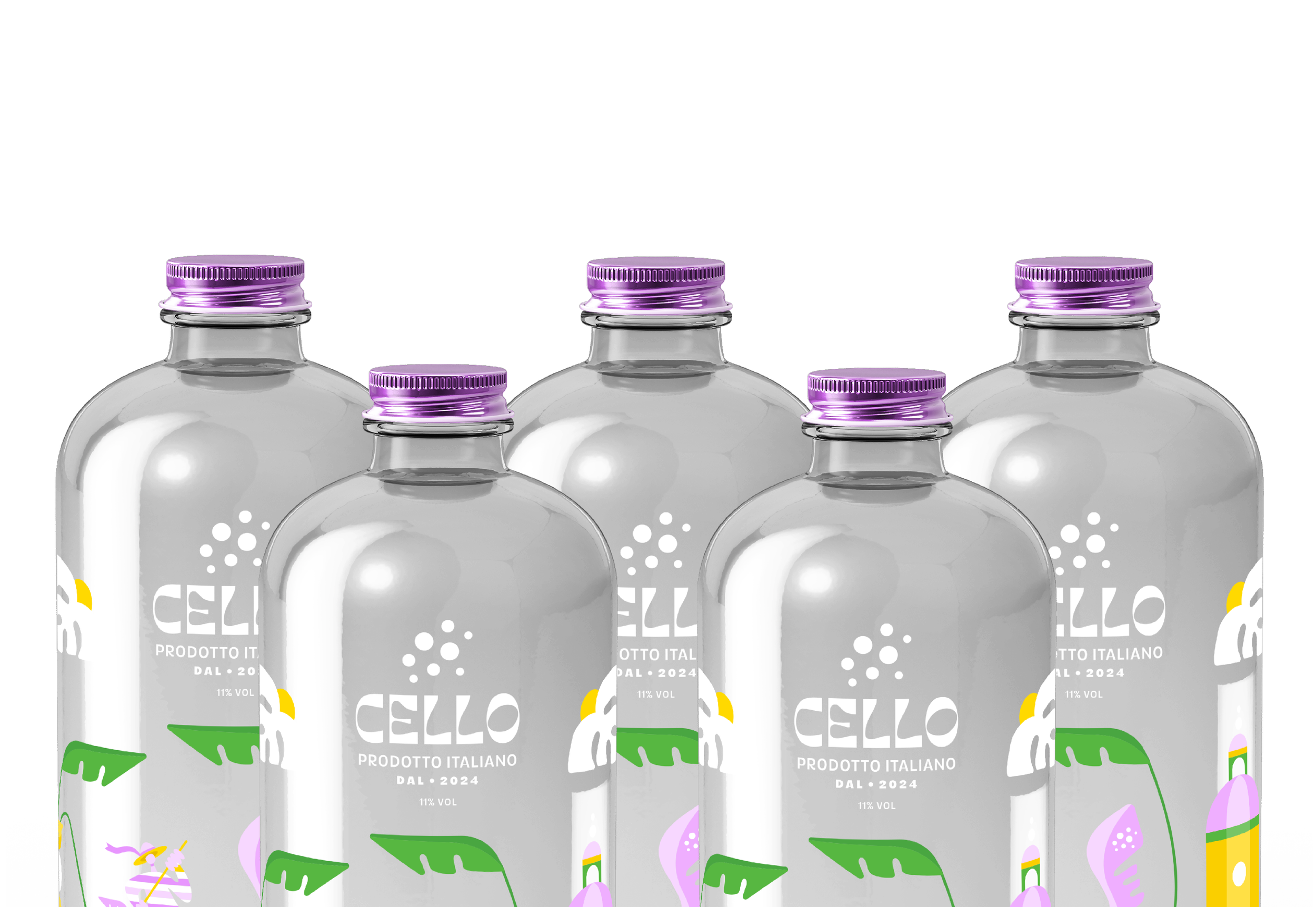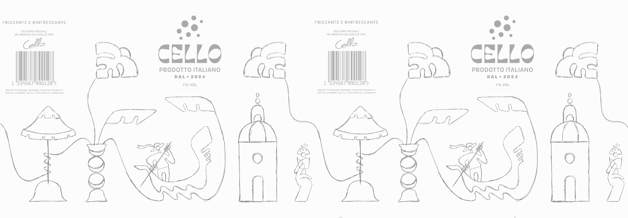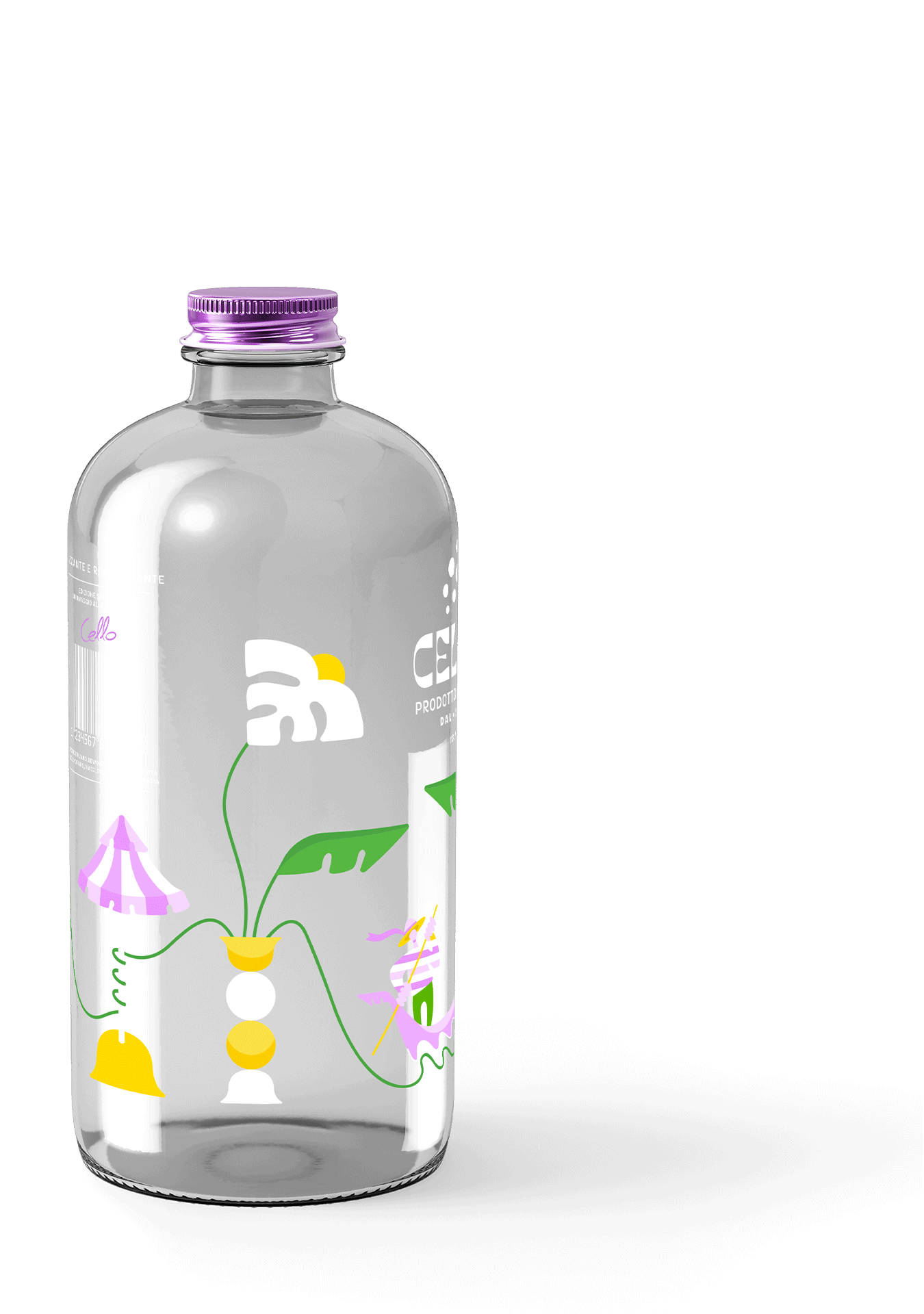

Cello is a brand of vodka spritz resembling the traditional Italian liqueur, limoncello. The visual identity is led by playful illustrations on its packaging, depicting moments in Italy such as a Venetian gondola, an Italian chapel, lemon flowers and a beachside umbrella with an uplifting and zesty colour palette.
STRATEGIC ANALYSIS

ARCHETYPE
The Lover is passionate, optimistic and evokes feelings of romance and intimacy, offering products or services that enhance relationships, pleasure and love. They appeal to consumers who value beauty, aesthetics, unity and fulfilment.
MISSION
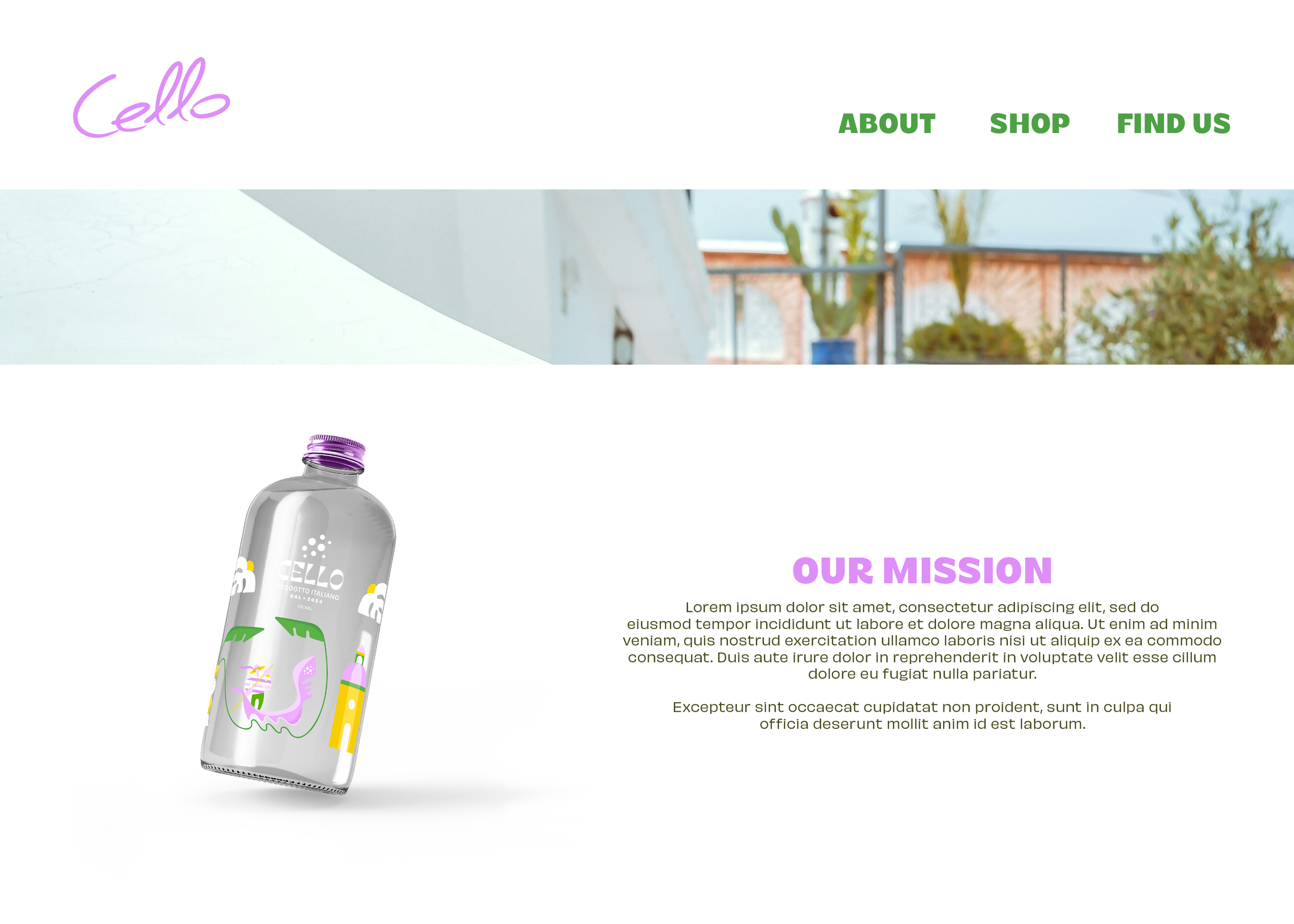
To redefine the daytime drinking experience for young adults seeking a refreshing aperitif by offering an interesting twist on tradition, perfectly suited for leisurely afternoons and lively gatherings under the sun.
AUDIENCE
Vibrant and passionate young adults who appreciate art, culture and quality but are also looking for something fresh and exciting. They value new experiences, connection and have an eye for the classics.
BRAND VOICE
Cello’s message focuses on the fresh and invigorating experience their product provides. They celebrate the joy of living and the pleasure of indulging in something time honoured yet intriguingly different. Each bottle is a promise of enjoyment delivered with a modern twist.

LOGO SUITE
The logo suite for Cello is reminiscent of conventional Italian signage and posters from the early 20th century. It combines nostalgia with a touch of quirkiness, modernising the rich cultural heritage of Italy. This old school type is infused with a vitalising colour palette to convey the passionate energy of Cello as a brand, including eye-catching elements that ensure it stands out on market shelves. The brand mark is a nod towards to bubbly, zesty nature of the product itself.

PRIMARY

SECONDARY

BRANDMARK
Cello has a zest for life and brims with optimism through the use of a bold colour palette and charming illustrations, enriching its romantic character. These scenes are depicted in both their packaging and marketing campaigns, conveying a sense of fun, joy and connection.
VISUAL IDENTITY

BLISS
#F1B1FF

FRESH
#5BB200

ZEST
#FFDA00